COVID Analysis
Since the first wave of COVID-19 has aroused, it has created havoc around the world. The rise in cases and their mutations are at an all-time high. Moreover, the strains are emerging themselves out of nowhere. But with advancement in the field of Medical Science, vaccines with up to 95% accuracy have been discovered. However, this makes it difficult for vaccine producers to create generic vaccine due to the newer strains that are growing up in various parts of the world.
Note:The main aim is not to extensively study the havocs caused by Covid in different countries through the last one year, that is already been done by so many great blogs out there. I'll focus on analyzing the second wave in some countries along with the extent of vaccination.
.A Brief summary of COVID around the world
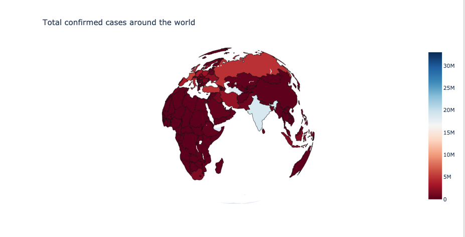
Before we begin, let's first view a world map with total confirmed cases in each country.
Data of Total Confirmed cases of Top 10 Countries
USA has the Highest cases amongst all i.e., over 30 million cases followed by India and Brazil which have 19 million and 15 million cases respectively.
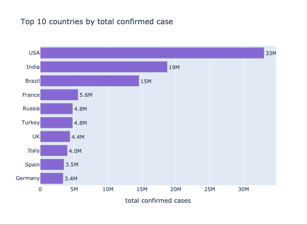
This isn't a very accurate stat for the countries worst hit by Covid, since it does not take the population into account.
Let's look at the top countries by total cases per 1 million population
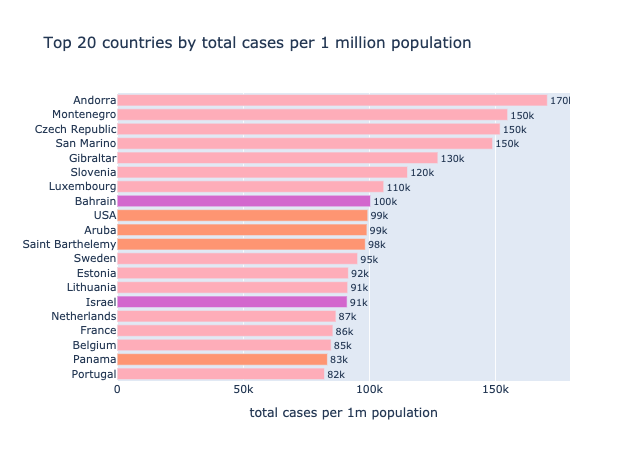
- Astonishing, most of the countries that made it into top 10 by the total number of cases, do not appear here when the count is normalized by population. USA and France are the only ones repeating
- 14 out of the top 20 are European countries, 4 are in North America and remaining 2 in Asia.
- Among the Scandinavian countries, Sweden and Netherlands appear in the top 20.
- Also, 1 out of every 10 person in America has been tested positive.
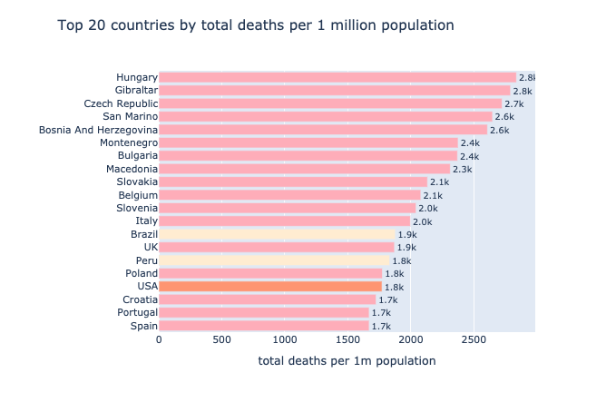
- One would assume that the countries worst hit by Covid would also record the most number of deaths, but this is not the case. There are other factors like dominant age-group,percentage of population with chronic illness, healthcare measures taken by the government like the rate of testing, public awareness and cooperation.
- This plot has more European countries than the one above it, 16 out of 20.
- Some countries that were not so severe with cases per 1m population like Spain,UK, Italy, Poland and Brazil have managed to appear in the top 20 for the worst death rates.
- Others like Israel, Swedeen, Netherlands and France have managed to have a relatively lower death rate.
The 20 top countries by total deaths per 1 million population
Top 20 countries in by total tests per 1 million population
A major factor in curbing COVID was the rate of testing. Let's see which are the top 20 countries in terms of tests per 1 million population.
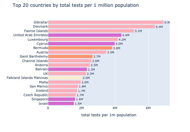
- Either something is wrong with the data or some countries were extremely privileged when it came to testing. 6 tests per person, that's an awful lot.
- Even this plot is dominated by European countries followed by Asian countries.
- Some countries worst hit in rates of cases and deaths, managed to conduct good amount of tests like UK, Gibraltar, Israel and Bahrain(both didn't appear in top 20 for deaths).
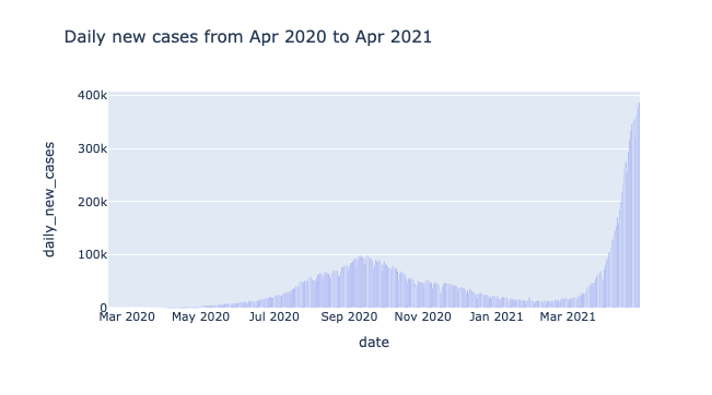
COVID Through Last One Year
It would be interesting to analyze the new cases counted every day for the last one year (approx) throughout the world.
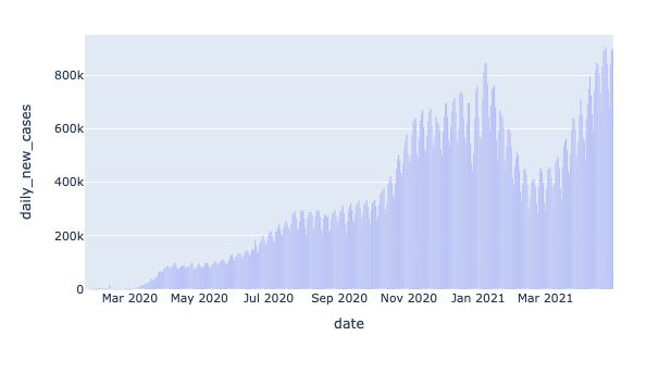
If we take data from most countries around the world into consideration then:-
- Covid kept infecting more and more people until mid January 2021- sometimes the slope is steeper like October-January , at times it is also levelled like August-October.
- After January 2021, the curve finally started a downward shift as the daily new cases kept reducing.
- At February the curve started an upward transition again and most of the world(or countries that contribute majorly to the population of the world) experienced what we'll call a Second Wave.
Daily New Cases
Let's do a more granular analysis of this trend. I have handpicked some countries that had most of the covid cases , let's visualize whether they did or did not see a second spike.
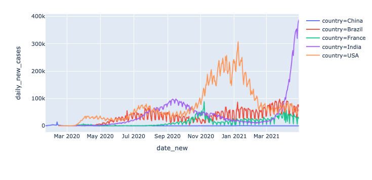
It's interesting to see how different countries have fared through time.:-
- The recent second wave in India is quite prominent as the spike is huge.
- The United States has a stable and relatively low number of daily cases since it's peak in January.
- Brazil and France also had a second wave, which isn't very clear from the graph. We'll analyze them seperately below.
- Quite unusually despite being the country of the origin of this virus,the new daily cases in China is extremely low.
Second Wave in USA
We'll start the analysis of the second wave by the United States
- The United States recieved it's peak(of the first wave) in daily cases in mid August 2020, when the count was about to touched hundred thousand new cases in a day.
- After this the sloped started a downhill ride almost as steep as the increase from April 2020-July 2020.
- Around mid November 2021, the curve started a gradual then later a steep increase in daily cases.
- On January 24 2021, the daily cases are ~243k, which is almost more tham thrice the cases during the first peak in Mid July.
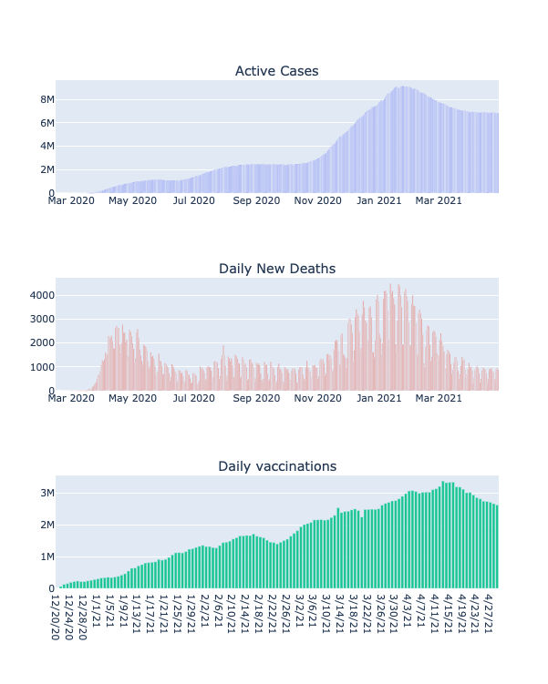
- The curve for active cases mostly follows similar trends as the plot above it, except it's much more smoother.
- The count for active cases in January is 1.49 million, almost 4 times the active cases during the peak in mid July.
- The curve for daily new deaths is more spiky and irregular.
- The number of daily deaths reported on January 16 2021 are 3585 and it is way above the usual limit.
- It is worth noting that on April 6th the daily death toll is 996, which is not more than 1.5 times the death toll during the peak of the first wave.
- The amount of vaccines being administered daily is also increasing rapidly, with periodic dips. Until now 147.5 million people have recieved their first shot and 97.1 million people are fully vaccinated.
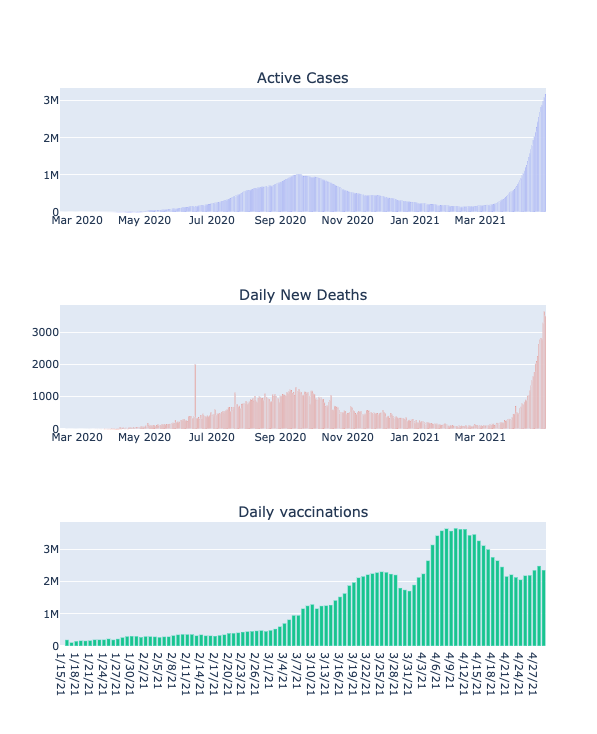
Second Wave in India
India is the second most populous country and is amongst the countries worst hit by Covid.
- India recieved it's peak(of the first wave) in daily cases in mid September 2020, when the count touched hundred thousand new cases in a day.
- After this the sloped started a downhill ride almost as steep as the increase from April 2020-September 2020.
- Around mid February 2021, the curve started a gradual then later a steep increase in daily cases.
- On April 24 2021, the daily cases are ~349k, which is almost 3.5 times the cases during the first peak in Mid September.
- After the first week of April, most states in India are under a complete lockdown.
- The curve for active cases mostly follows similar trends as the plot above it, except it's much more smoother.
- The count for active cases on April 18 is 1.93 million, almost 2 times the active cases during the peak in mid September..
- The curve for daily new deaths is more spiky and irregular..
- The number of daily deaths reported on June 16 2020 are 2006 and it is way above the usual limit. It could easily be a typo.
- It is worth noting that on April 18th the daily death toll is 1625, which is not more than 1.5 times the death toll during the peak of the first wave.
- The amount of vaccines being administered daily is also increasing rapidly, with periodic dips. Until now 107 million people have recieved their first shot and 16 million people are fully vaccinated. These are people above the age of 45 as currently they are the only ones eligible.
So, what caused this catastrophic Second wave in India?
During late January and February when the daily cases in India reduced a lot, the people and even government officials made the mistake of assuming the worst was over. Despite seeing a second wave in European Countries, the possibility was ignored. Regulations on social-distancing and wearing masks were relaxed. People started believing that the population would develop herd immunity. Also, vaccines were considered sufficient in the battle against covid.
Now, let's compare India and The United States on deaths and vaccination.
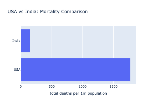
- The ratio for deaths per 1m population for India and USA is 1:13
- The United States clearly has much higher mortality rate than India.
Could this be due to difference in vaccination?
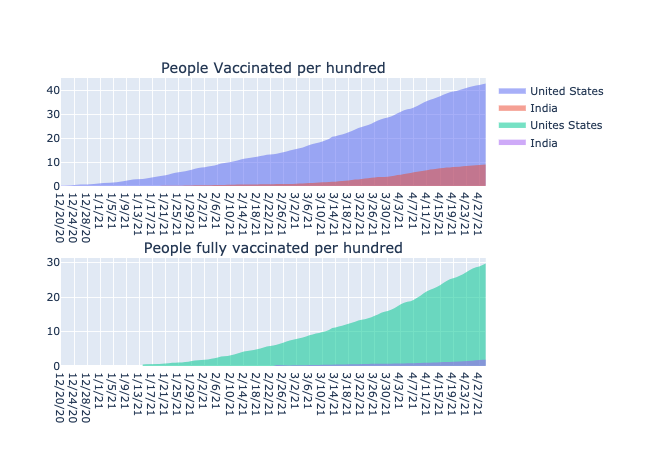
- Vaccination covergae in the United States has clearly been way better than India's.
- Vaccination started a little earlier in USA than it did in India and has been more rapidly increasing ever since.
- For a group of hundred people, roughly twice as many people have gotten their first shot in USA.
- For the second shot, the ratio is even bigger , 1:4.
Second Wave in European Countries
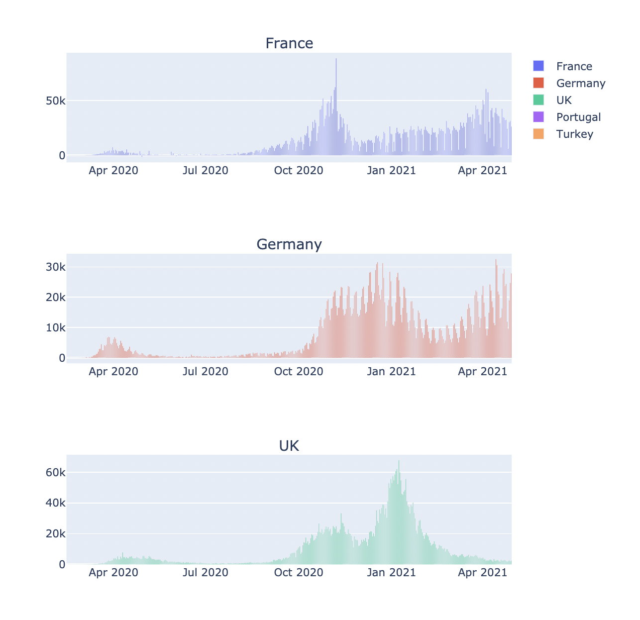
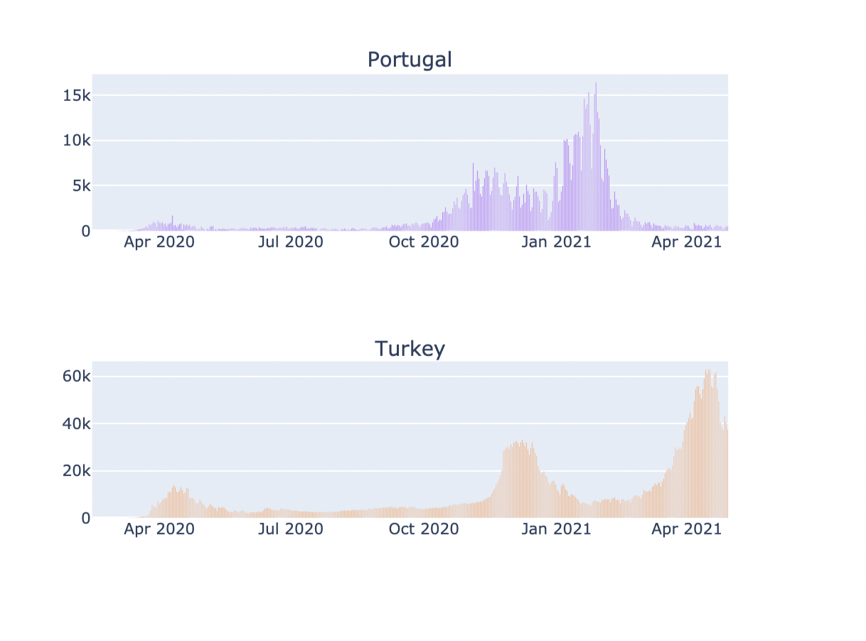
There are a lot more European countries that saw a second wave, I've chosen a subset of them here.
- The second wave in these countries started much early around October-November unlike India and USA.
- For all of these countries the second wave caused way more infections than the first wave and for some countries like France and Poland, cases during the first wave are almost negligible in comparison.
- Turkey's second wave came in late November, a little later than in other countries. After a decline later in January, the cases started increasing again in March and are still on the rise. The daily new cases in April are twice it's peak during December.Turkey possibly has a third wave.
- The same goes for Germany, after the second wave subsided in February , the daily new cases are reaching a new peak again.
- Portugal on the other hand is a country, that brutally got hit by the virus during the second wave. After the peak in late January , the country has managed to bring back it's daily cases to as few as 200-300.
- UK follows a curve similar to Portugal. Although, the number of cases are much higher due to the country's population. The second wave started around late September. It is also worth noting that the highest recorded daily cases(peak) in UK was on January 8 2021 with 67,928 cases while for France it was on November 7 2020 with 88,790 cases. (This could be the highest for Europe)
Daily new deaths for European Countries
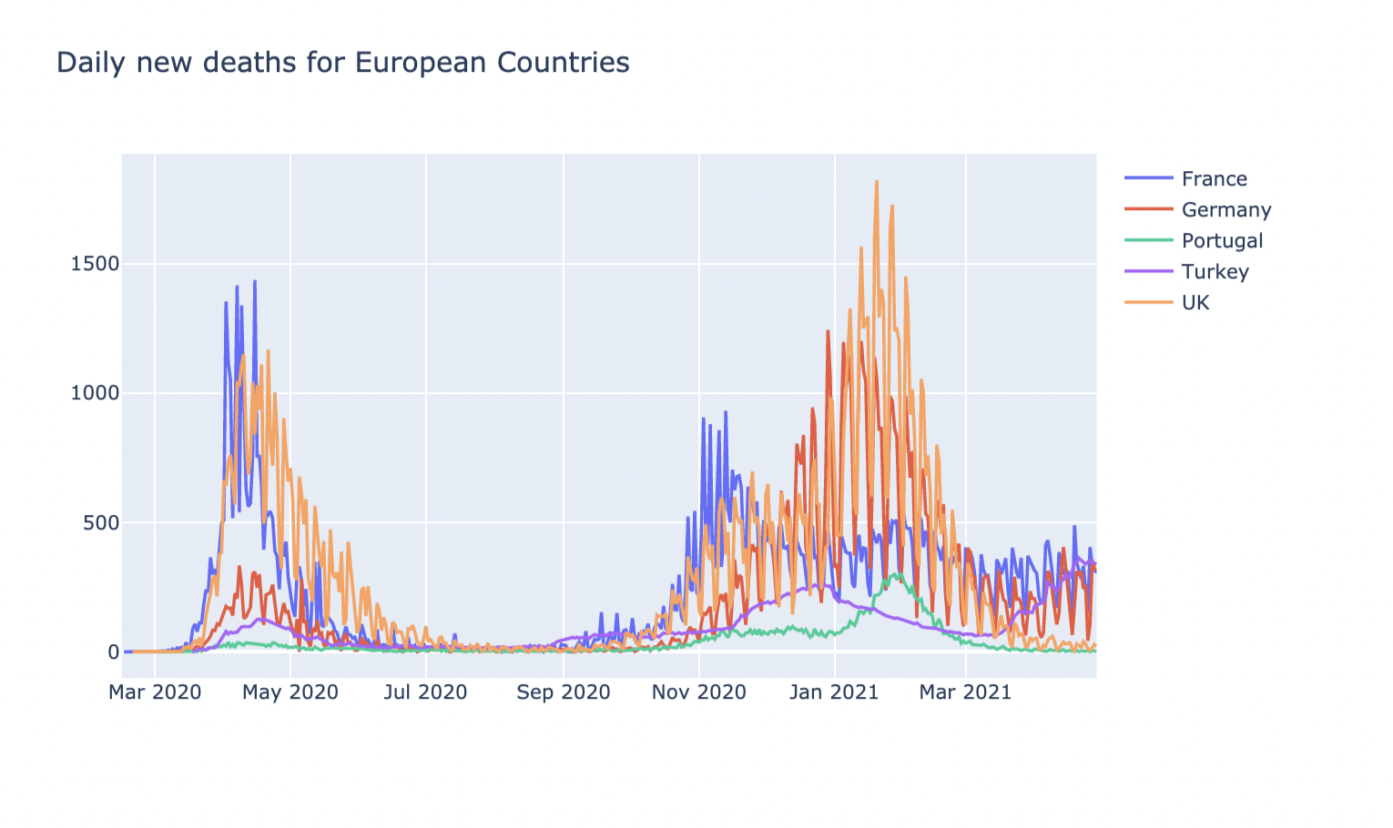
- During the second wave, even though France's daily new cases were almost 10 times than during the first wave, France kept it's daily death count to almost half this time. The country was able to cope better.
- For Germany and UK, the case was opposite, as the number of daily cases increased so did the death count which surpasses the average daily death count for the first wave. As we already saw, the infection cases in Germany are on the rise , but the death rate has gone down slowly. While for UK the curve for daily cases and daily deaths have both gone down a lot.
- Turkey on the other hand is not doing so well, along with the new cases rising every day, so is the death count.
- Portugal's death count after the second wave has almost reached zero.
Let's compare deaths per million population for these countries.
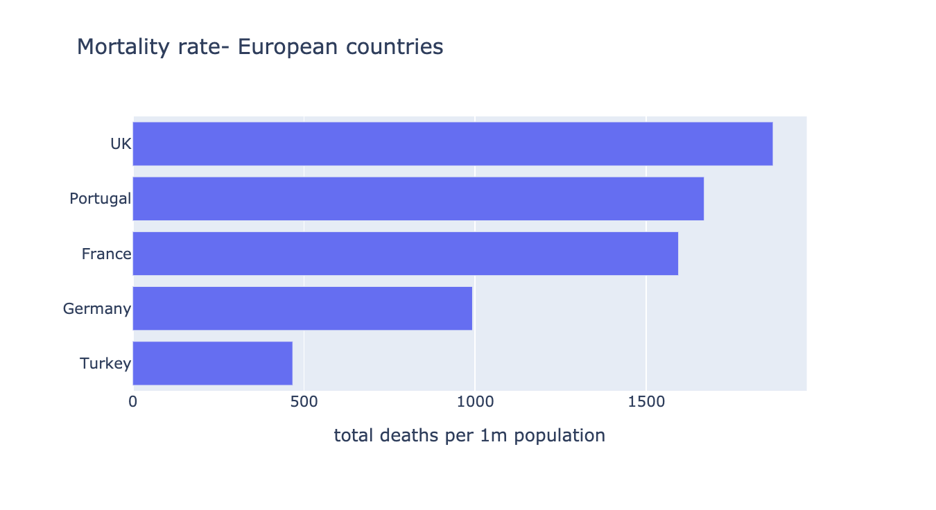
- While most of the deaths in Portugal came from the second wave, it was the opposite for France.
- Even though Turkey's mortality rate is comparitively low, if the same trend in daily deaths continue, we are going to see a rise in this too.
It is clear, that some countries did well during the second wave, some didn't.
Vaccinations
- UK has a remarkably high vaccination rate. They have ordered more than 400 million doses of seven of the most promising vaccines. Three have so far been approved for use:Oxford-AstraZeneca; Pfizer-BioNTech; and Moderna. Oxford-AstraZenca, one of the most widely used vaccine is made in different locations in Britain. You should check out this article for detailed analysis on vaccination in UK.
- Mostly UK has been giving first doses, around the last week of March it shifted focus from that to giving second doses.
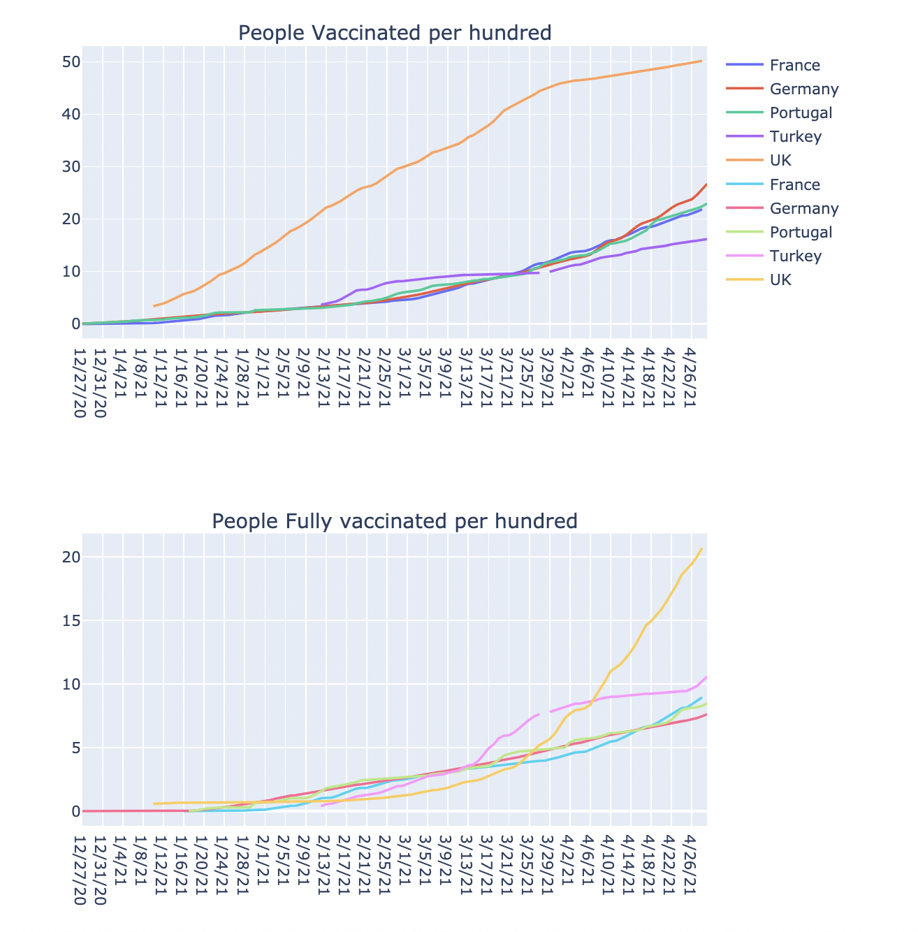
- The vaccination curve for France, Germany and Portugal is following almost the same trend. France is doing a little worse in giving second shots of the vaccine.
- Turkey's curve has either been taking over or dipping below the general trend for the the remaining three countries.
- Turkey started vaccinating quite late in mid February. Initially, Turkey's rate of giving first vaccine shots was better than the three countries.
- Then in mid March, it shifted focus to administering second shots of the vaccine.
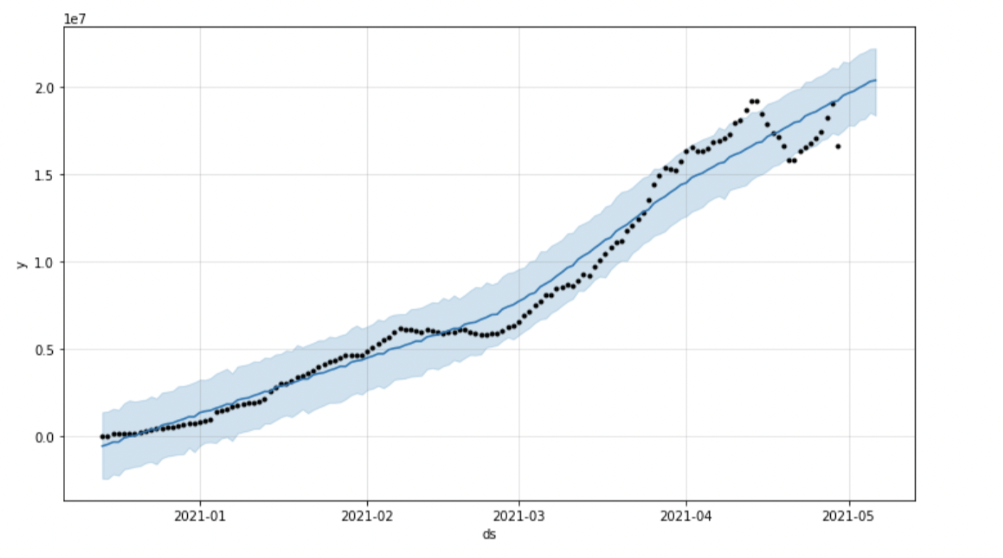
Forecasting
Let's Forecast the Data to predict the Vaccination Drive by weekly
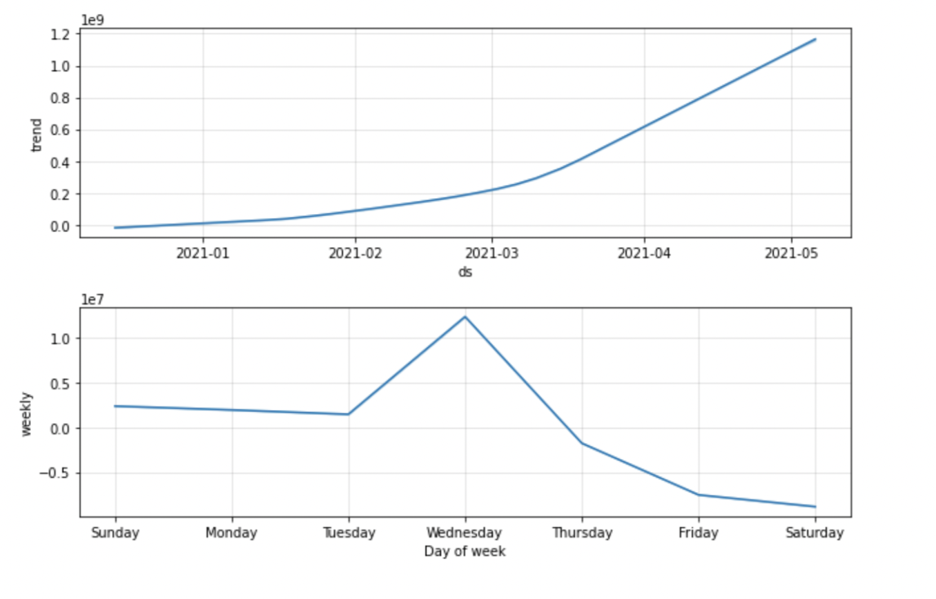
Predicting the Daily Vaccinations by next week
- The graph shows that on Thursday, there will be least Vaccinations
- The day which will have the Highest Vaccination is Friday
- Monday and Tuesday have almost same amount of Vaccinations.
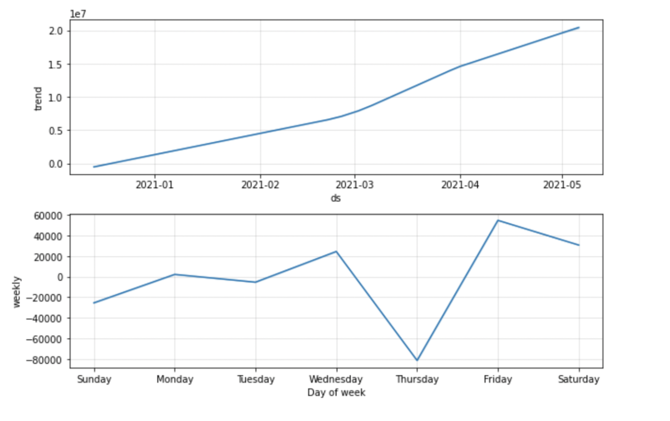
Predicting the Total Vaccinations by next week
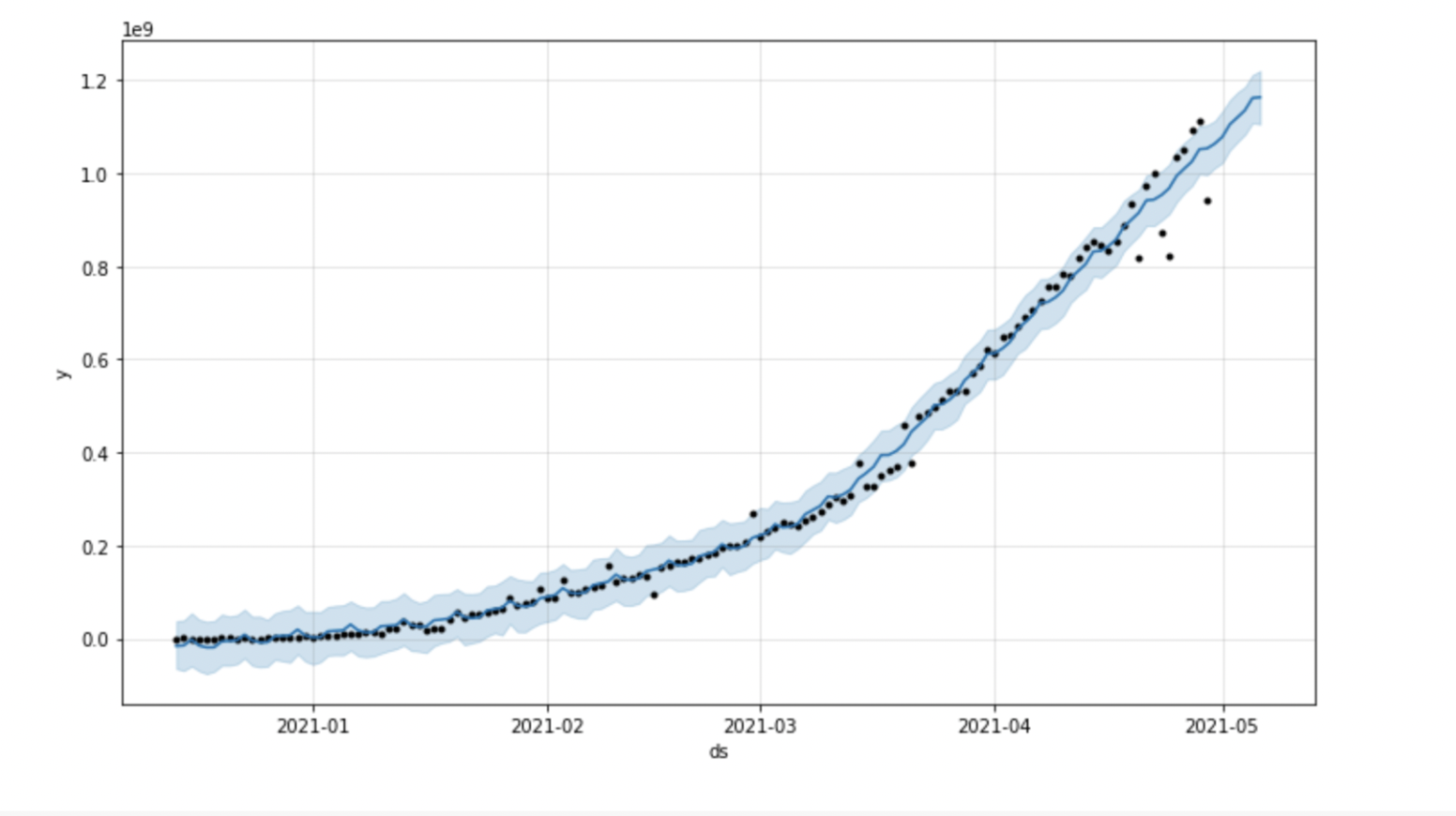
- The graph shows that there will be a sudden increase in Total Vaccination from Tuesday to Wednesday.
- On the other hand, the total Vaccination will gradually decrease by Saturday
- Sunday to Tuesday will have almost same amount of Total Vaccinations.
Predicting the number Fully Vaccinationed People by next week
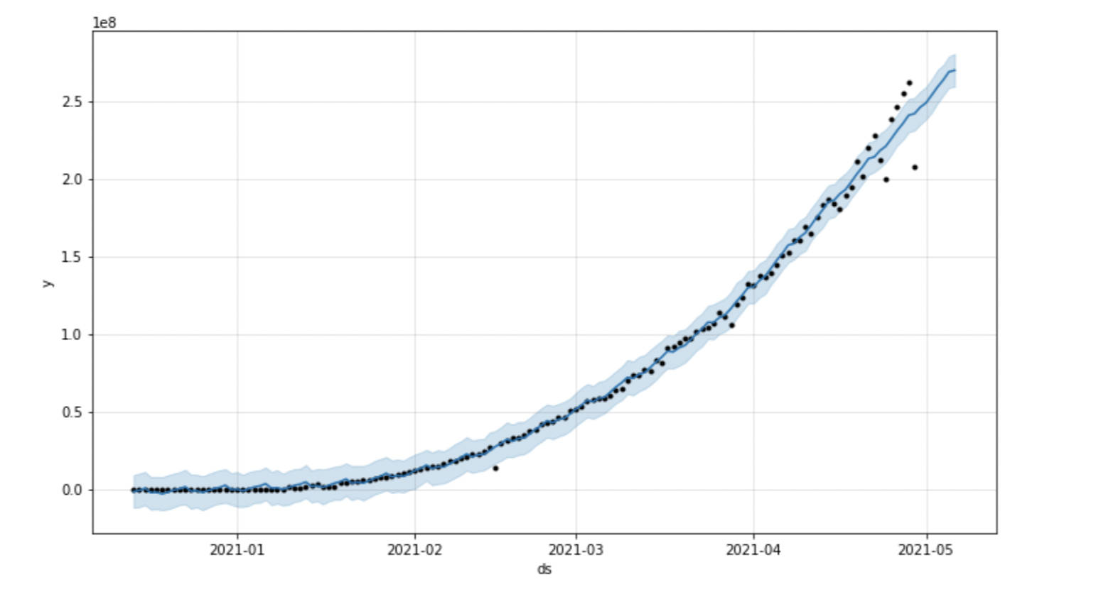
- The graph shows that the number of people that will be Fully Vaccinated would be increasiing from Sunday to Wednesday
- From Wednesday to Thursday, there will be sudden decrease in People Fully Vaccinated.
- Till end of the week, the Number of people getting Fully Vaccinated would decrease.
Challenges and contributions:
There are large datasets as some of the independent data are correlated with other data. I have collect datasets from different sources in order to get accurate prediction I had used Autoregressive Integrated Moving Average (ARIMA) for forecasting, but the result was not as accurate
In the Refrences I have used word different techniques for prediction I have used Prophet for Forecasting the time series data based on an additive model where non-linear trends are fit with yearly, weekely, and daily seasonality. I have Predicted the Data of Daily Cases, Total Vaccination and People Fully Vaccinated. Using this, will be able to predict the Vaccination Drive.
Conclusion:
After using Prophet and forecast, I can predict that how many people will get daily Vaccine by end of the next week. How many daily Vaccinations will be provided and number of people who will be Fully Vaccinated by end of the next week.
Datasets Used:
- https://www.kaggle.com/ibtesama/covid-19-the-second-wave-vaccination/data?select=worldometer_coronavirus_daily_data.csv
- https://www.kaggle.com/ibtesama/covid-19-the-second-wave-vaccination/data?select=worldometer_coronavirus_summary_data.csv
- https://www.kaggle.com/ibtesama/covid-19-the-second-wave-vaccination/data?select=country_vaccinations.csv
- https://www.kaggle.com/ibtesama/covid-19-the-second-wave-vaccination/data?select=country_vaccinations_by_manufacturer.csv
References:
- https://www.kaggle.com/ibtesama/covid-19-the-second-wave-vaccination/data?select=country_vaccinations_by_manufacturer.csv
- https://www.kaggle.com/josephassaker/covid-19-global-data-analysis-visualization/notebook?select=worldometer_coronavirus_summary_data.csv
- https://www.kaggle.com/paultimothymooney/usa-covid19-vaccinations
- https://www.youtube.com/watch?v=_Hi6_JQesSQ
- https://www.youtube.com/watch?v=sHWKN5dakPw&ab_channel=Simplilearn
- https://medium.com/analytics-vidhya/time-series-analysis-using-prophet-in-python-part-2-hyperparameter-tuning-and-cross-validation-88e7d831a067